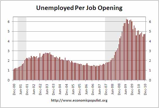
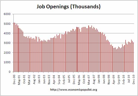
JOLTS stands for Job Openings and Labor Turnover Survey. The December report shows there were 4.73 official unemployed people hunting for a job to every position available. If one takes the official broader definition of unemployment, or U6, the ratio becomes even worse, 8.40. There were only 3,063,000 job openings for December 2010.
The job openings rate was essentially unchanged over the month at 2.3 percent. Both the hires rate and the separations rate were unchanged at 3.2 percent each in December.
Bear in mind this is only the official 14,485,000 December unemployed, it's not counting the disappeared unemployed as well as the forced part-time, temporary, which U-6, seasonally adjusted is currently 25.7 million for December 2010. The ratios might be skewed somewhat due to the yearly adjustments in the BLS CPS. The updated numbers in the January unemployment report were used to calculate the number of people needing a job to the available jobs for December 2010.
Additionally, this ratio is worse than October, where the ratio of official unemployed to jobs openings was 4.5, although bear in mind these are ratios and based on the CPS survey, which has it's own margin of error.
We can see some of this in the actual hires from December 2010, totaling 4,184,000. This is incredibly low and flat.
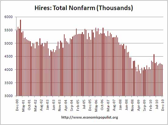
Below are total job separations, 4,162,000, with the term separation meaning you're out of a job through a layoff, quitting or retirement. Notice how separations is almost equal to the number of hires, 4,184,000. Seems the revolving door has come to working America, although not quite the same as the one in Washington D.C.
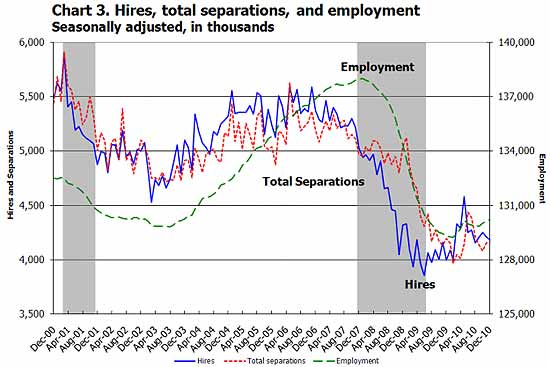
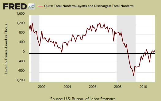
The number of quits or voluntary job separations is becoming dangerously close to the number of fires. Want a choice of employers? Doesn't seem to be much of an option today.
In December 2010, the proportion of quits for total nonfarm was 48 percent and the proportion of layoffs and discharges was 44 percent. For total
private, the proportions were 49 percent quits and 44 percent layoffs and discharges. For government, the proportions were 33 percent quits and 51 percent layoffs and discharges.
Below are quits minus discharges and layoffs. What this graph shows is how people do not have a choice in jobs, the number of people being forced out of their job is more equaling the number who plain quit, which implies little choice and those who have a job are hanging on for dear life. This is with layoffs and firings now at pre-recession levels.
The JOLTS takes a random sampling of 16,000 businesses and derives their numbers from that. The survey also uses the CES, or current employment statistics, not the household survey as their base benchmark, although ratios are coming from the household survey, which gives the tally of unemployed.
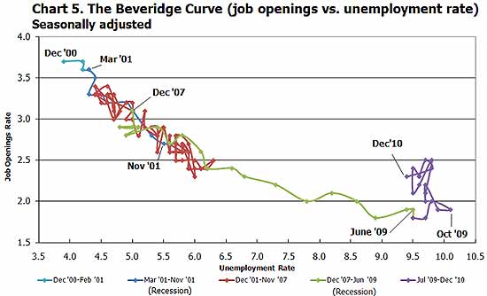
The BLS was kind enough to make a credible Beveridge Curve graph, reprinted below. The Beveridge curve shows the official unemployment rate vs. the job openings rate. If you see a bunch of data points to the far right, that's bad, it means there is long term unemployment and not enough jobs. Look at how we're stuck to the right, the green shows how fast we went to the right and stuck there, meaning there are no jobs. This graph shows working America is in big trouble.
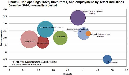
For the JOLTS report, the BLS creates some fairly useful graphs, some of which were reprinted here, and they have oodles of additional information in their databases, broken down by occupational area. Below is a reprint of their bubble graph, and the first thing to note is how health and educational employment dwarfs manufacturing. For economies of scale, we really need to see that manufacturing bubble grow and grow, it's about 11% of the total economy which is not good for a host of reasons.
To put these ratios into perspective, there were 4.8 million job openings in March 2007 and believe this or not, the low point of job openings was in July 2009, where the number has increased 31%, or 700,000 to 3.1 million for December 2010, obviously not enough jobs.
Here is our November's JOLTS report overview.

graphs & such
I had to quickly create a few original graphs. Seems St. Louis Fed wasn't into updating their database today. There is one graph, which is still from the St. Louis Fred, which should auto update tomorrow, but the monthly change levels are so similar, I think it's valid for 12/10 and that is the quits vs. being fired difference graph. (it should be updated tomorrow, normally the St. Louis Fed is on the case in terms of updating their databases).
Which makes me wonder folks, I can, actually start maintaining excel spreadsheets are start running original graphs for all data, instead of using the FRED system. Maybe that's a good idea, but the FRED system can create graphs so much faster and on top of things, their excel auto formats are more amenable to graphing, further calculations, the BLS, literally, I could not even get a download of the data today, I had to hand update data from FRED. Then, one has to reorder or deal with multiple columns and crud, bigger hassle.
Anyone reading this what do you think, start running original graphs? The look would improve (sorry, in a hurry today), because I would be updating the graphs per data releases.
So, back to this report, once again, we have the same bad news! Not enough job openings, job creation for the unemployed, although the JOLTS is a 1 month data lag from the unemployment report.
Still, it's dismal. The BLS Beveridge curve closely matches up with that infamous graph from Calculated Risk comparing job losses over time to pass recessions.
Will this ever end?
The Mire vs Reporting
First, good work making it all so clear.
Ok, so now explain why we hear that the job picture is improving, and our economy is on the rise. Just kidding, no one can explain that except the White House. It's strange how putting the numbers together is 180 degrees from the sugar-coated biased reporting about how hiring is taking place, and that we've bottomed-out and on the way up. The Beveridge Curve, Chart 5, shows exactly what I've been taking about for awhile now. Contrary to what Mr. Obama thinks, there are no jobs, and jobs aren't going to fall from the sky. If there are a few jobs in one place, they're off-set by job losses in another place. in other words, we're not gaining on the situation.
Chart 6 shows construction is where it'll more than likely stay for some time to come. At this time, there's no reason to believe that construction will be a boom industry anytime in the near future.
After all is said and done, my question is what will be the catalyst that turns things around, if they ever do turn around. With all of the information being reported, it's hard to imagine a scenario where we go from where we are now, to economic progress and stability in the near future. What will cause mass hiring for an extended period?
Considering the number presently unemployed, and the number entering the workforce for the first time, there's no way to catch-up and keep caught-up with the demand. It would take a solid net gain of 300,000 per month for the next 4 years minimum. What incentive can produce those numbers?
In my opinion, we're in deep do-do.
Because you can do wrong, and get away with it, doesn't make it right
by every metric
Your conclusion of "deep do-do" is showing up in the numbers. I've been reading various economists online (many on the right hand column) who are digging deep into the economics/statistics/BLS data at this point, with everyone who is in statistical reality (as well as just walking down the street and looking around reality), saying "where are the damn jobs" in one form or another.
Housing Market and Jobs
Some believe that the housing market and foreclosure problem are closely tied to the jobs market. They believe that so many businesses are connected to real estate, that the economy will remain in a slump until folks start buying houses again. But, now the argument is the new tight restrictions on packaged mortgages will further hamper an already depressed market. An example of the ill effects of very slow jobs growth and the housing market can be seen in these charts.
Another interesting item on the jobs picture:
ForecastChart.com projects the unemployment rate will be 9.6 by January 2012, which doesn't jive with the reports of around 8.6 seen in the main stream media circles.
Because you can do wrong, and get away with it, doesn't make it right
U-6, 8.05, 840
I might mention where that U-6, or broader definition of unemployment is coming from.
I took U-6 directly from the updated December data that was released in the January unemployment report. There is a huge adjustment in December, so I'm not convinced these ratios are that accurate, but it's what we've got.
For January, U-6:
Basically it's 16.1% of the civilian labor force, or 24,663,000 people. (God that's HUGE!)
But if you try to hand calculate that out, by the U-6 definition and the unemployment report, you'll get:
U-6 = U-3+marginally attached+part-time economic reasons
= 25,070,000
The reason for the difference is the breakdown from the BLS of marginally attached is not seasonally adjusted, but the rest of the metric (i.e. U-3, part time, economic reasons, civilian labor force) are seasonally adjusted.
I just saw a bunch of random numbers being quoted for what U-6 for 01/11 is, so I thought I'd run through this.
So, JOLTS lags 1 month and the above did use the updated numbers but regardless,
Bottom line for every job, there are at least 4 people, if not 8 people looking and wanting one. Haven't even covered those who have dropped out and are really in the weeks called not in the labor force.
More restrictions, less rewards
When my state doubled the tolls for roads I use regularly, I assumed that there would be a improvement in coin processing speed at the toll booths. I'd time it to toss the coins in and move through just as I had before. Mon Dieu! I kept running the red lights and setting off bells until I had a moment of Zen - why should I expect that they would improve the toll booths just because they were charging more?
The response of government and the business sector to increased joblessness reminds me of the tolls. There's no obligation to improve things, just an offering up of the same old policies. Unfortunately, one policy coming back is to allow mass extortion via the power grids. ENRON-o-nomics has returned to afflict Texas. No fuss down there. The Attorney General is after "sexting" teens and the governor is whitewashing the state budget to preserve his bid for the presidential nomination (Republican).
Prices go up, services decline, Obama "embraces big business," and the new Congress has barely begun it's side show. Starting out to be a great year.
The U6 figures are the honest approach to the financial troubles. That's why they're seen here and other sites that care about reality but hardly ever in the corporate media. Might upset people (as though they don't know already).
Michael Collins
U-6 backed up by "long term unemployed"
I suspect the real unemployment rate is higher than U-6, in part, because there are no jobs to hunt for and how long this has gone on now.
I've noticed individuals who are 99ers, or more, speaking up and interviewing on TV. In the past, when an individual did that, they would get character assassinated, in order to "blame the victim" and dismiss the problem through character assassination. Some of these people who are interviewing are so pristine in their credibility and background and skill levels, it's made it impossible to attack them personally to attempt to discredit their experience.
Which is about time! Pobody is nerfect and every person in this country has made mistakes or has flaws, but that media/press attack the person piping up, who is not a media professional really stuck in craw as unethical. There you've got some regular person, going public and instead of listening to what they were describing, they would get attacked in order to minimize what they were actually describing is the situation.
What irks me also on this is many of these long term unemployed people are so talented, they really could rebuild America.
I noticed the same thing myself
The era of commercial Calvinism and Ayn Rand's deviant strain are over. Almost everyone feels vulnerable, except those who pull the strings to enrich their small crew. This can't go on for a much longer. The absurdity of flat job growth for 10 years is only exceeded by the failure to discuss or seriously address that phenomenon. Talk about malfeasance. But they think they're doing just fine, the leaders who give each other awards as their failures create an artificial history of contraction and failure.
Michael Collins
BLS Bubble chart at the end
Odds one we're going to hear more "structural" unemployment which is code speak to claim American workers just suck and that's why they are not hiring them. (Bogus).
So on the bubble graph, you see openings vs. hires. So, when you see a high openings with low hires, that means employers in that area are being absurdly picky.
But I think it's somewhat misleading because Professional services seems like it has openings and hires, but in comparison to the past, they too are being absurdly picky.
So, the bubble graph is relative to the month of December, not a historical comparison.
Check out the JOLTS website, there is a lot more graphs than the ones I reposted and details.
JOLTS jobs
One other aspect of the JOLTS that seems to be overlooked is the type of job available. The BLS doesn't keep track, nor does Indeed.com or the Conference Board, of the job quality, since all jobs are lumped into one category; jobs. Jobs aren't separated by full- or part-time, day labor, temporary, 1099 or seasonal. I'm sure if the job openings were full-time, then there wouldn't be so many part-time workers who want to work full-time. If roughly 20% of the JOLTS jobs are not full-time jobs, that results in even more competition for the remaining "real" full-time jobs. A rough estimate: 25,000,000 million looking for 2.5 million full-time jobs would be closer to 10 job seekers per job. Not a pretty jobs picture at all.
thanks, part time jobs in JOLTS
On their website I didn't drill down that far, but your points are good ones.