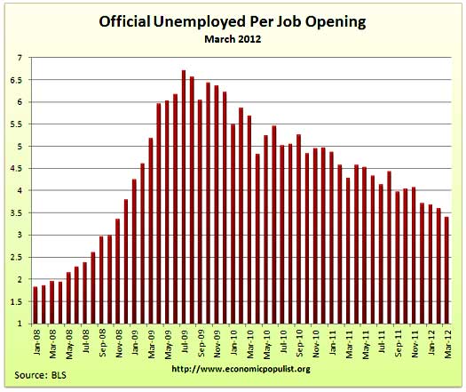
JOLTS stands for Job Openings and Labor Turnover Survey. The March 2012 statistics show there were 3.39 official unemployed people hunting for a job to every position available*. There were 3,737,000 job openings for March 2012, an increase of 4.83%, from the previous month of 3,565,000. The press shouts this is the largest number of jobs openings in four years, that's actually wrong. This is the highest number of job openings since July 2008. We were 8 months into the great recession and there were way less people needing a job in July 2008. Openings are still way below pre-recession levels of 4.7 million. Job openings have increased 71% from their July 2009 trough, yet opportunities are still way below the 1.8 persons per job opening at the start of the recession, December 2007. Below is the graph of March official unemployed, 12.673 million, per job opening.
If one takes the official broader definition of unemployment, or U-6, the ratio becomes 6.07** unemployed people per each job opening for February. The February U-6 unemployment rate was 14.5%. Below is the graph of number of unemployed, using the broader U-6 unemployment definition, per job opening.
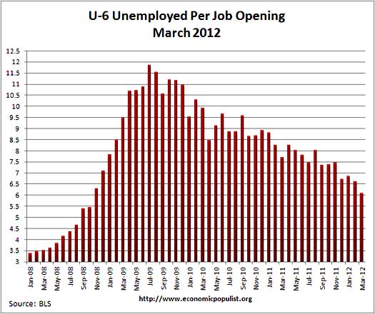
If you do not like the use of U-6 to look at the real number of people looking for a job to actual opportunities, consider this number. In March 2012, of those not in the labor force, 6,299,000 were actually wanting a job. U-6 only includes 2,352,000 of these people.
The rates below mean the number of openings, hires, fires percentage of the total employment. Openings are added to the total employment for it's ratio. Opens increased a 10th of a percentage point while both hires and separations had no change. Here again is more evidence of a pretty bad jobs market. Discharges and quit rates also did not change from February.
- openings rate - 2.7%
- hires rate - 3.3%
- separations rate - 3.1%
- fires & layoffs rate - 1.3%
- quits rate - 1.6%
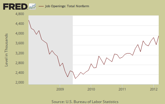
Below are raw job openings, still below the 4.7 to 4.3 million levels of 2007.
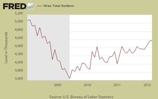
March hires were 4,356,000, a -1.98% change from February's 4,444,000 hires.
Below are total job separations, 4,153,000, a 0.7% increase from last month's 4,124,000. The term separation means you're out of a job through a firing, layoff, quitting or retirement. The report has a breakdown of separations, hires and openings across occupational categories. Layoffs and firings were 1,683,000 of the total 4,153,000 and to pre-recession levels.

For March, of total separations, the quits were 51.7% whereas layoffs and fires were 40.5%. Below are quits minus discharges and layoffs. When quits comes close to firings that means people have little choice in employment. You want to see choice, or quits, rise and be much higher than firings. The below graph shows people still do not have that many options when it comes to a job, for the ability to quit your job, shown in the number of quits, 2,147,000 for March, is still way below pre-recession levels of 2.8 million. The ratio of quits to firings, is nowhere near the 2009 mass firings and layoffs, yet it's clear people are still afraid to quit their jobs and for good reason.

The JOLTS takes a random sampling of 16,000 businesses and derives their numbers from that. The survey also uses the CES, or current employment statistics, not the household survey as their base benchmark, although ratios are coming from the household survey, which gives the tally of unemployed.
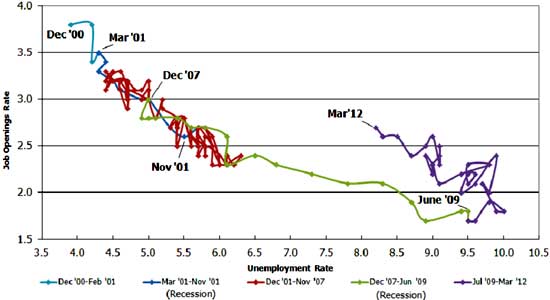
The BLS was kind enough to make a credible Beveridge Curve graph, reprinted below. The Beveridge curve shows the official unemployment rate vs. the job openings rate, over time. If you see a bunch of data points to the far right, that's bad, it means there is long term unemployment and not enough jobs. Look at how we're stuck to the right. December 2011 moved left and up. That means job openings increased, the unemployment rate decreased. The March 2012 unemployment rate was 8.2%. A right and up move in the Beveridge curve can indicate a skills mismatch, so this graph also refutes the corporate lobbyists claim there is a skills shortage per their cheap labor arbitrage agenda. The green, representing the 2009 time period, shows how fast we went to the right and the purple, which is 2010-2012, means we are stuck in job market malaise.
The March 2012 up and left move on the Beveridge curve is better news, but from the graph we can see a long, long way back to pre-recession ratios. Check out how awesome 2000 was for landing a job in the graph below.
JOLTS includes part-time jobs and does not make a distinction between part-time, full-time openings. A job opening reported to the survey could literally be take out the trash twice a week and be counted. This is a shame, it would be nice to know a little more about the quality of these new opportunities.
For the JOLTS report, the BLS creates some fairly useful graphs, one of which were reprinted here, and they have oodles of additional information in their databases, broken down by occupational area. Manufacturing job openings increased by 55,000 in March. Government, on the other hand, job openings decreased by -26,000 with -20,000 of those losses in state and local government. The Saint Louis Federal Reserve also had loads of graphing tools for JOLTS.
*The BLS rounds up to 1 decimal place.
** is defined as the official unemployed plus people who are in part-time jobs for economic reasons plus the marginally attached. The marginally attached,
, are officially not part of the civilian labor force,
, and also not seasonally adjusted. The above graph was created by the seasonally adjusted levels of the unemployed, part-time for economic reasons and the marginally attached. The raw U-6 totals can also be calculated by this formula, which gives a slightly higher ratio of 6.09.
where

Even today the media puppets + pols. still spouting lies/PR
These stats are excellent, as always. Just proving to us out here in the field what we experience every day, and unfortunately my brain refuses to quit (it'd make living in the US so much easier nowadays).
- Today we find in the news the Governor of Maine telling his fawning sycophants in a convention that the unemployed should just get off the couch already and get those jobs - you know, those jobs dropping from the sky (these JOLTS stats don't make sense for those who don't like to read). Rick Perry, a recipient of govt. funds himself, said he supported that thought. But it's not a D or R, issue, because both sides of the same nonthinking coin in the oligarchs' pocket.
- On the other side, we have MSNBC (a hardcore DNC shill) celebrating the fact that a 22-year old posted his mug on a billboard and got a job in sales. The comments on that site are 10-1 (and that's a iberal site) bashing the unemployed, celebrating his "creativity," and devotion to finding a job. The "welfare/lazy 99ers" meme is also present (forgetting the fact that millions of people were never eligible for one day of benefits or ran out long ago).
Basically, the message is damn those unemployed people! If only they had no problem paying for a billboard to plaster their mugs for all to see. I'd hire a surgeon via that route. Laid off physicist from NASA? Put your face on a billboard! Undercover police officer laid off in budget cuts? Put your face on a billboard? Factory worker laid off because of private equity takeover and layoffs? Put your face on a billboard!
Billboards solve all problems. Don't worry about ID theft and being taken as a joke by 99% of the people driving by. Don't think about reasons unemployed are unable to find jobs like the unemployed vs. job opening ratio, age discrimination, being overqualified, being unable to move because of an underwater house, not being able to take an internship when you have college loans for that "worthless" engineering degree >$100,000.
The media (Fox, CNN, MNBS, CNBS, etc.) and the politicians say you are to blame for being unemployed - put your face on a billboard already!
-Kurtz
Unbelievable, thanks for sharing that
They have got to be kidding. Even if one reads just the BLS material and this is a statistical release, they are saying it's still a piss poor job market (my translation).
This is why I cover statistical releases, either the MSM gets it outright wrong and come on, I mean the government releases these reports so people, especially politicians, policy makers and the press, can actually read them!
This "blame the person" is B.S. and yeah, we expect that from the right, to blame people for bad policy, but I've seen that coming from the left many a time, blaming workers.
Anyway, link this up and pass it around, that's what why it's here. Maybe half a dozen graphs staring them in the face will make these people wake up. The job market still sucks big wankers and it's going on 5 years. Half a decade.
The BLS NFP figure is
The BLS NFP figure is notoriously unreliable on an individual monthly basis.
Separately, your takeaway of all this data is oddly negative. To my untrained eye, things continue to improve, albeit not at the rate that most would like. But the rate at which things can improve is circumscribed by the state the the global economy, in particular the developed economies within it, finds itself in. That state itself is a function of the mess that it was in 5 years ago, and that itself a function of all the prehistory that we know and do not love.
Constantly we hear people moaning about how crap everything is, how the government (whether of the US, UK, whatever) needs to fashion and implement a "pro-growth policy", as if that is something that it is not only possible but easy to do, if only they would stop deliberately dragging their heels and put their minds to it.
Well, it is not. The system has been well and truly screwed, and it will take time to heal.
improved true....but....
Even in 2007 the job market was pretty crappy and from the graphs, I'm making a point that things are not even back to crappy 2007 for labor. The negative amplification slant is multi-fold. First, you're right, the monthly BLS figures are revised, seems generally one needs to almost look at BLS data at least quarterly, plus we have April not looking too good so this might be a data blip.
Then, the MSM press headlines repeatedly try to act like an 8.1% official unemployment rate is just fine, and a 8.1% unemployment rate is still obscene. So, this is to pour cold water on those denial cheerleaders who want to somehow brush millions of unemployed under the denial rug.
Then, as another noted, politicians are acting like job openings, which the BLS reported in their official statistical release as unchanged, somehow means there are jobs out there to employ people and there are not. It's better but no where near where things need to be and this has been going on for over 4 years, which is a phenomenally long time.
Are Drop-outs included?
Improved? All the statistics show the jobs being created are at Burger King and Starbucks.
Does that 3.4 /job figure include those who have dropped out of the labor force? I can assure you that if you have an MS in engineering, no one will hire you at Burger King.
JOLTS, 3.4 people per job opening does not include drop outs
No, that's the "official" unemployed. The second graph is U-6 per job opening. I show what's included in the alternative unemployment rate published by the BLS. U-6 has "some" drop outs, but not all, only people who looked in the last 12 months who are "not in the labor force".
Additionally JOLTS includes part-time jobs and U-6 includes a large number of people already stuck in part-time jobs who want and need full-time real ones. So, while there are 6.1 people per job opening, part of those people, in U-6, are not gonna want to go from one crappy low paying part-time job to another one.
I wish the JOLTS survey would report hours per job opening and wages, benefits as well. For example retail trade is notorious to be mostly really low paying, no benefits, part time jobs, leisure and hospitality is even worse. Yet within these very large job categories, there are a few good jobs.
Anyway, as a thumb in air weathervein this ratio still tells you the jobs market really sucks and I would claim most in the press refuse to acknowledge there are WAY more people competing for these jobs than in 2007. In other words, one cannot just take levels and say "whoopee, job openings have increased almost to 2008 levels" for in 2008, they were WAY LESS people looking for work.
If you look to the left, we create our own "alternative" unemployment rate, see here, which was 16.6%. That ratio includes the BLS published statistic of those who are officially dropped out, not counted, as part of the labor force, but report they want a job.
Other economists are quoting even higher "real" unemployment rates, but we use what the BLS publishes to come up with ours.
So, U-6 shows there are 6.1 people wanting a job per opening. I didn't do our "alternative" unemployment rate of 16.6%, but roughly, that would be about 8 people per job opening.
Since you mention a MS EE, and you should write your elected officials that this should be changed, the BLS counts foreign guest workers, H-1B Visa holders as "employed" and that job being taken by a H-1B, L-1, F-1, OPT as a job. That artificially pumps up the occupational employment statistics. That should be recategorized as jobs outsourced, not entered into the employment statistics and separated, by both the CES and the CPS employment surveys.
It's not a job opening, or opportunity to hire a H-1B foreign guest worker, not for the U.S. labor pool and American jobs market.