The Mortgage Monitor for May (pdf) from LPS (Lender Processing Services) is a monthly report we continue to cover, even though it's rarely mentioned in the financial press, because it's really the only report that gives us an accurate picture of the condition of all the mortgages in the US and of the ongoing mortgage crisis on a monthly basis. Note that although the Mortgage Delinquency Survey from the Mortgage Bankers Association covers some of that same data, it's only issued quarterly, but since the comparisons are very close (MBA shows slightly higher delinquencies), it confirms the verity of the monthly LPS data...
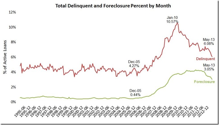
 According to LPS, 4,469,000 mortgages, or 9.13% of all first lien mortgage loans, were at least one payment delinquent at the end of May; that's down from of 4,699,000 that were delinquent at the end of April, and down from the 11.08% of mortgages that were past due a year earlier. Of those overdue mortgages, 1,525,000 mortgages were in the foreclosure process, another 1,335,000 mortgages were 90 or more days delinquent, but not in foreclosure, and 1,708,000 more loans were over 30 days and less than 90 days past due, but not in foreclosure. The 3.05% of mortgages in foreclosure at the end of May was down from 3.17% at the end of April and down from the 4.17% in foreclosure a year earlier, while the 6.08% that were delinquent but not in foreclosure was down from April's 6.21% and the 6.91% delinquency rate of May a year ago. 116,812 foreclosures were started in May, compared to 127,496 in April and in contrast with the 218,900 foreclosure starts in May of 2012. This slowdown in foreclosure activity was confirmed in another release this week from RealtyTrac, who reported a total of 801,359 U.S. properties with foreclosure filings of all types in the first half of 2013, 19% lower than the last half of 2012 and the lowest since 2006...
Since most of the data in this 31 page pdf report is graphically presented, we'll select a few to include here with explanations; click any for an enlargement. Our first graph above, from page 4 of the mortgage monitor pdf, shows in green the percentage of active home loans that have been in the foreclosure process from 1995 to the present; these are those mortgages against which the servicer has initiated the foreclosure process but has not yet seized the home through a foreclosure sale, which typically transfers the ownership of the property to the bank. Although this foreclosure inventory is at the lowest of the crisis at 3.05% of all mortgages, it's still 5.7 times greater than the average foreclosure inventory of the 1995 to 2005 period. The above graph also tracks the percentage of loans that have been delinquent monthly over the same period in red. Although the delinquency rate of 6.08% of active loans has fallen from a crisis high of 10.57%, its still 1.4 times the average delinquency rate of the '95 to '05 period.. Also note the seasonally of delinquencies in that red track; typically, some homeowners forgo a house payment or two as children return to school or as the holidays approach (or when a new iphone is released); then start to catch up on mortgage payments after the holidays, so invariably the delinquency rate falls over the first 3 months of each year, which it did even at the height of the crisis...although the 15% year to date decline in mortgage delinquencies this year is the largest year to date seasonal decline since 2002, we would not be surprised to see delinquencies increase again in the coming months...
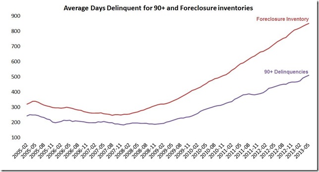
 Our next graphic is from page 6 of the mortgage monitor pdf, and it illustrates the ongoing lengthening of the seriously delinquent and foreclose timeframes The violet line starts in 2005 and tracks the average number of days seriously delinquent properties have remained more than 90 days past due without foreclosure action.. As of May, the average length of time that a seriously delinquent mortgage has gone without making current house payments is now at 511 days, up from 503 last month (the data for this chart is on page 20 of the mortgage monitor, and also here). The red line tracks the average number of days that homes in the foreclosure process have remained in limbo without being seized, and that's now up to 852 days. Obviously, as we've seen, the total foreclosure inventory has declined over the past two years, but for some of those homeowners that have entered the process, especially in judicial states where the right to foreclose must be established in court, the process continues to drag on with no end in sight. Since the average of 852 days in foreclosure includes at least several hundred thousand homes that have entered into foreclosure in the past year, it's a safe guess there are at least as many that have been in foreclosure for over four years.
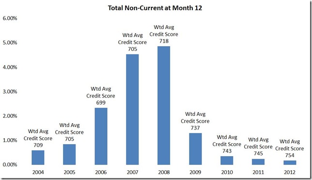
 The third graphic we'll look at is from page 16 of the mortgage monitor pdf and it shows the percentage of home mortgage loans that became delinquent within 12 months of purchase by year, and the weighted average credit score for mortgages originated in each year. Although not included on this bar graph, LPS notes that the weighted average credit score for 2013 originations is 754.. While LPS includes this graphic to show how recent vintage mortgages with pristine credit quality have continued to perform, what is surprising here is the percentage of new homeowners that were already behind on their house payments in 2006 and 2007, before the serious housing bust and higher unemployment rates took hold.. It's clear that late in the housing boom, a significant number of people were being put into mortgages that they were apparently unable to keep up with payments on. You can click on this graph, or any graphic here, for a larger view...
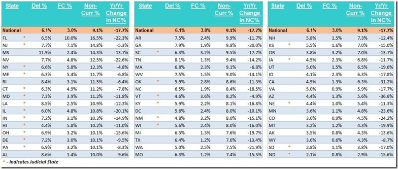
The final plate from the mortgage monitor that we’ll include here below is from page 19, and it is a table of non-current mortgage percentages in all 50 states and the District of Columbia. The first column is the delinquency rate for each state, or the percentage of mortgages in each state that are at least one month behind and not yet in foreclosure. The second column is the percentage in each state that are in foreclosure, and the third column is the total non-current percentage, or sum of the first two. The last column is the year over year percentage change in non current mortgages in each state. Note that judicial states, where banks must establish their right to foreclose in court, are marked with a red asterisk. These states have the highest percentages stuck in foreclosure, led by Florida, where one in ten mortgaged homes were in foreclosure as of the end of May. Other judicial states with a foreclosure inventory greater than 5% include New Jersey at 7.1%, New York and Hawaii at 5.8%, and Maine at 5.4%, whereas Mississippi's presence high on the non current list is mostly due to the 11.9% of their residents who are one or more than one payment behind on their mortgages. (click to enlarge table)
(crossposted from Marketwatch 666)


Comments
that doesn't look like a "booming housing market" to me
We need to do something here about images. I cannot read many of these even when clicking on them to display the full image. Email me but no point in going to all of that trouble if we cannot easily view graphs and images.
Ok, overall, it still looks fairly elevated to me in comparison to 13 years ago, 2002, etc.
Sure they are dropping but in comparison still quite high for foreclosures, delinquencies..
images
all my blog posts start as emails, so my methods were developed for that use...my images are screen captured or copied to the paint utility, which i then crop or alter using windows photo gallery as necessary before i post them on my wordpress workspace, in order to be able to copy and mail them...
maybe i find them easy to read because i'm familiar with the material...but in each case i cite the source and page number of the original document, should readers want a better view...
rjs
generally speaking
I'll look into it, but we need images that scale and zoom, automatically from cell phones to the biggest display out there. So, yours I really cannot read but the site needs a better solution. Just be aware I cannot read the table for now.
ok, i'll have to figure that out...
having it larger in my workspace didnt change the linked size:
http://rjsigmund.wordpress.com/2013/07/12/graphics-week-ending-july-13/
rjs